

The Psychology of Color in Workplace Design
Crafting an optimal workplace extends so much further than simple visual appeal. Thoughtful office design can influence employee well-being, mood, and output. Therefore, a vital aspect of how your employees work is office color psychology


At Office Interiors, we prioritize the principles of office color psychology to engineer superior workspaces. Let's talk about how!
Understanding Color's Influence
Choosing the right color scheme for your workplace can have a surprising impact on the overall mood of your office.
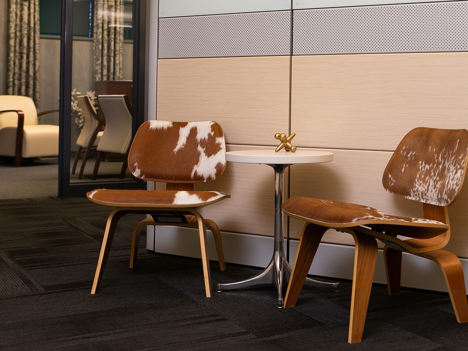
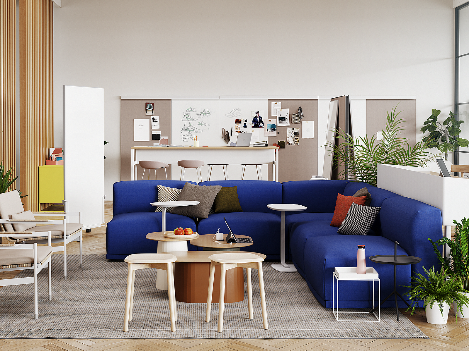
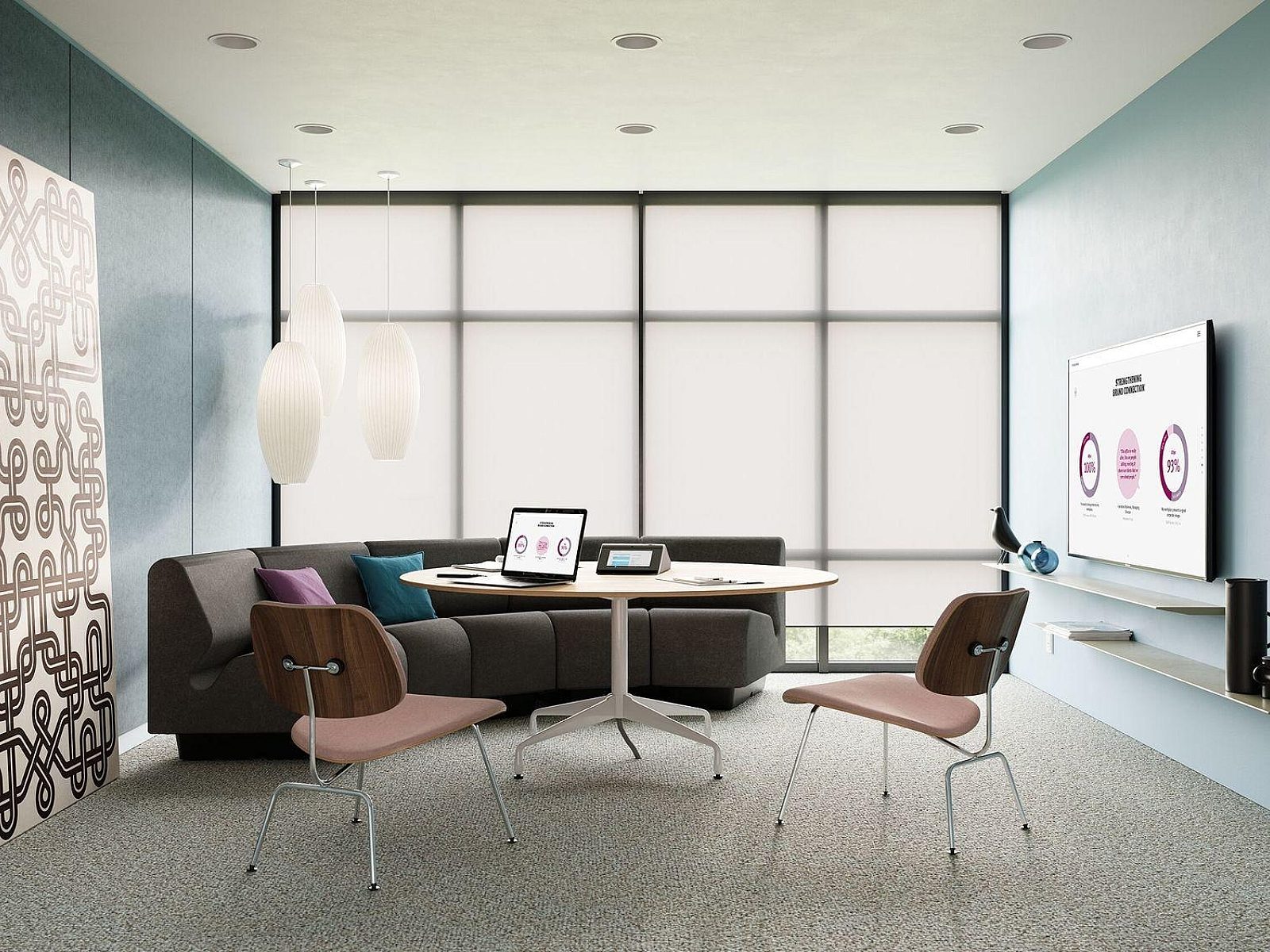
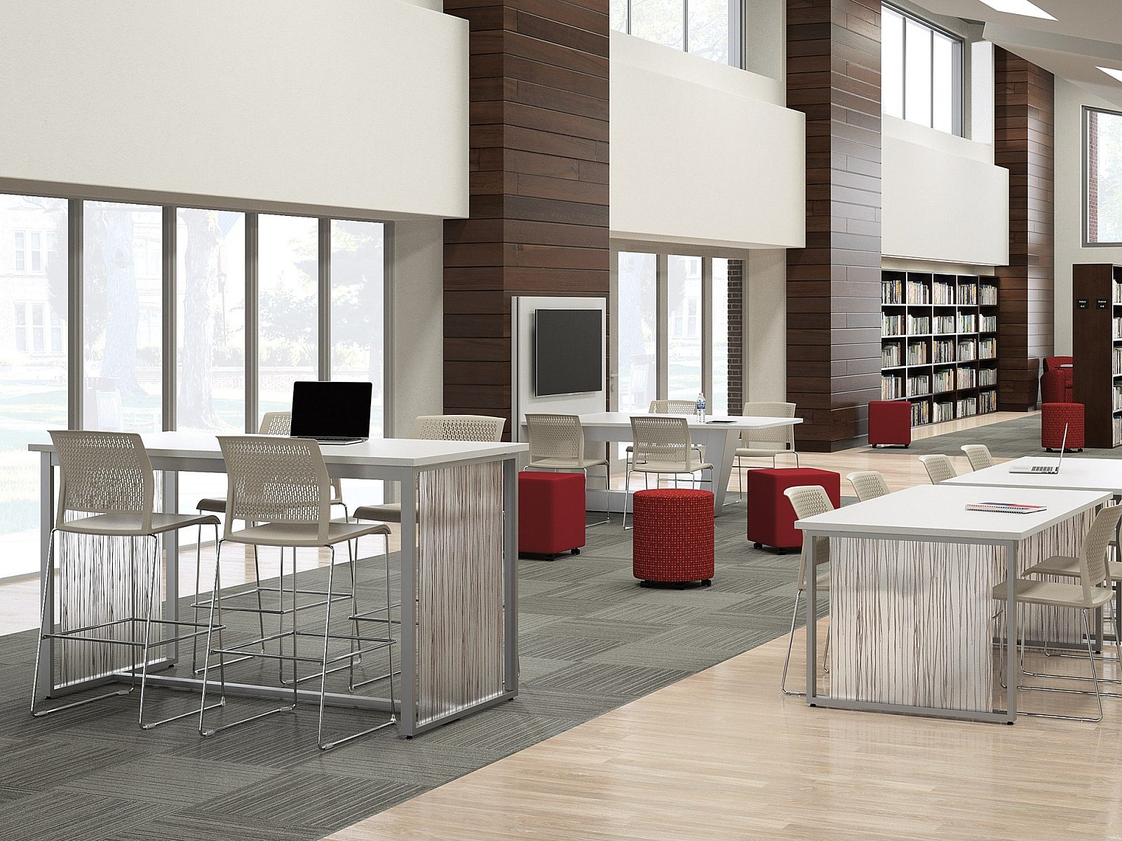
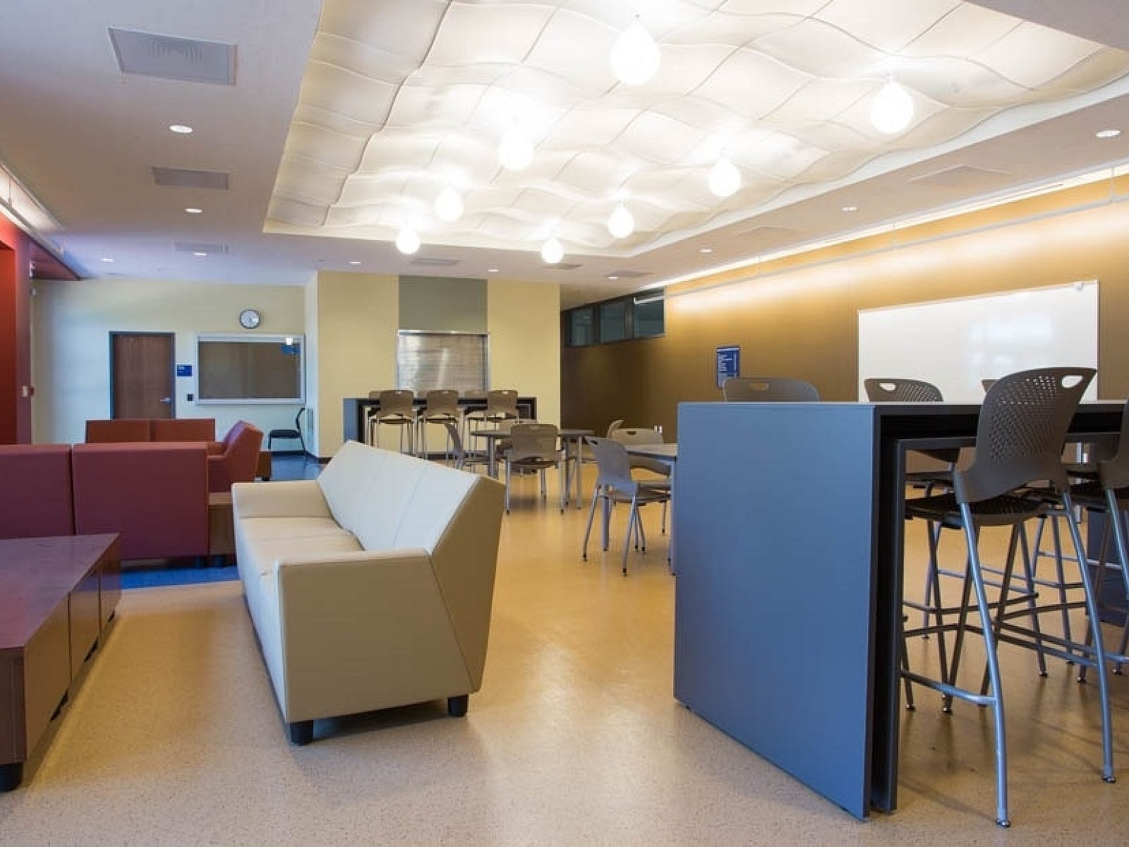
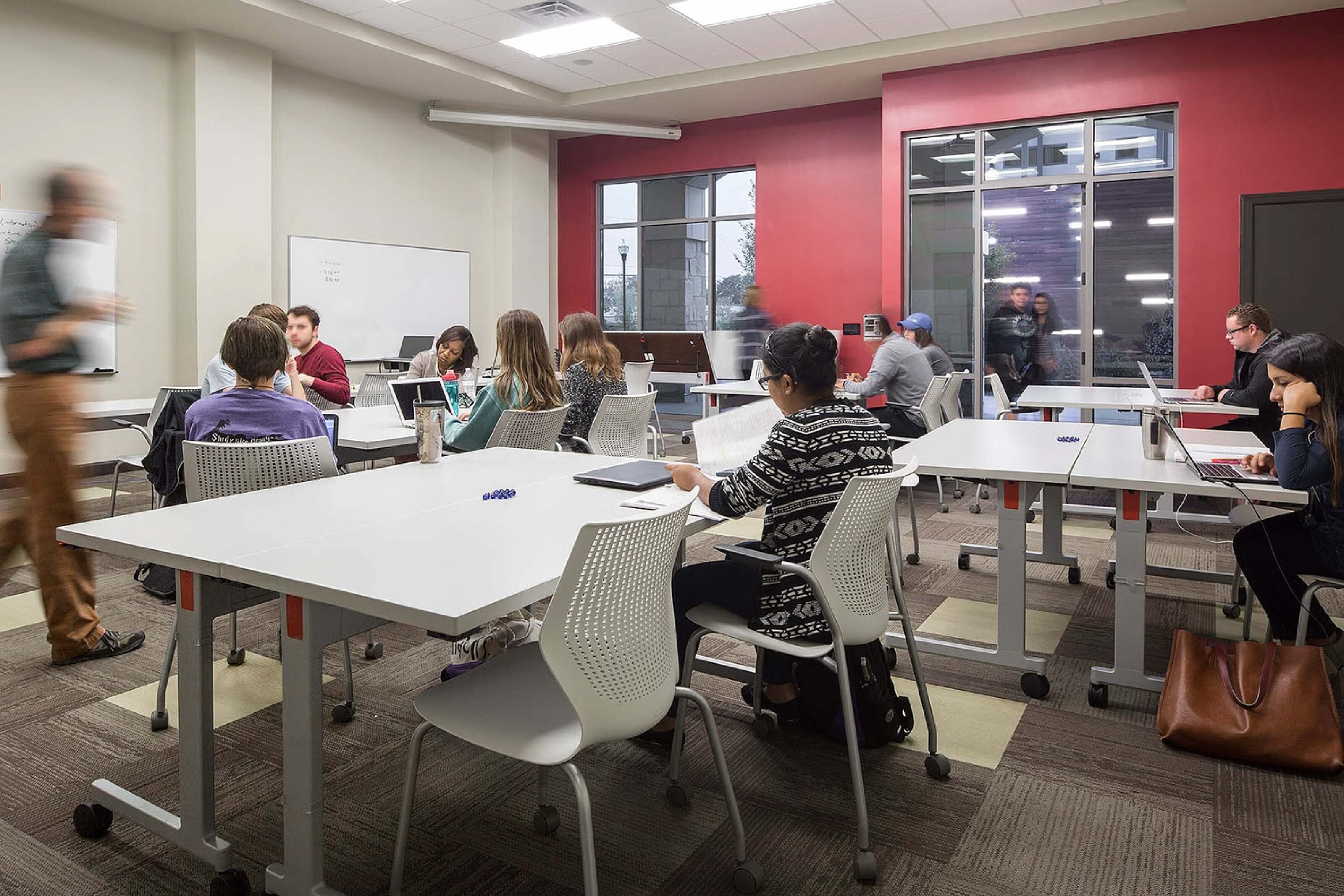
- Warm Tones: Hues such as red, orange, and yellow are linked with vigor, innovation, and teamwork. Red, for instance, can inspire drive and prompt action, making it suitable for dynamic zones like collaborative lounges.
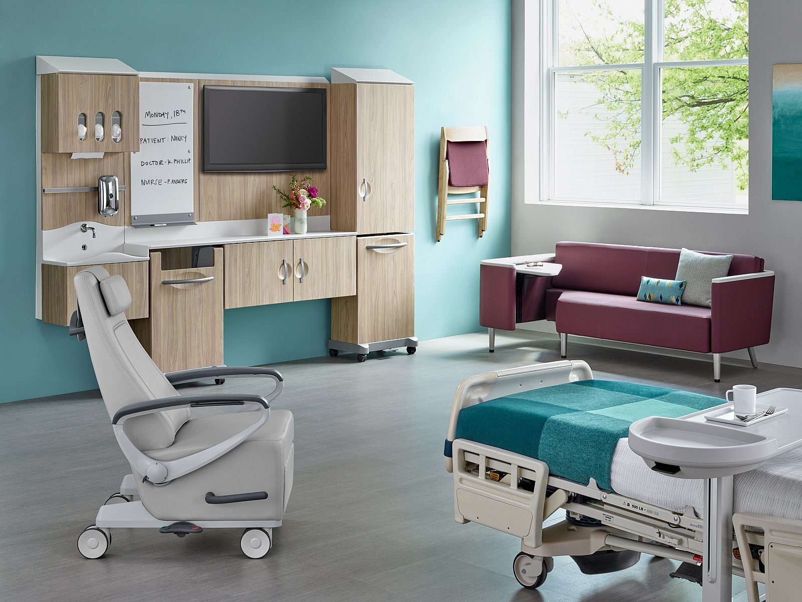
- Cool Tones: Colors like blue and green cultivate tranquility, concentration, and effectiveness. Blue promotes trust and deep thought, making it an excellent choice for individual work areas.
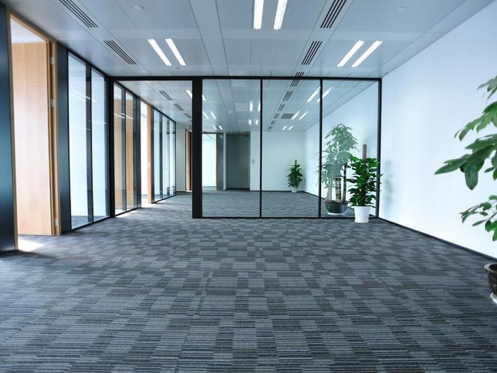
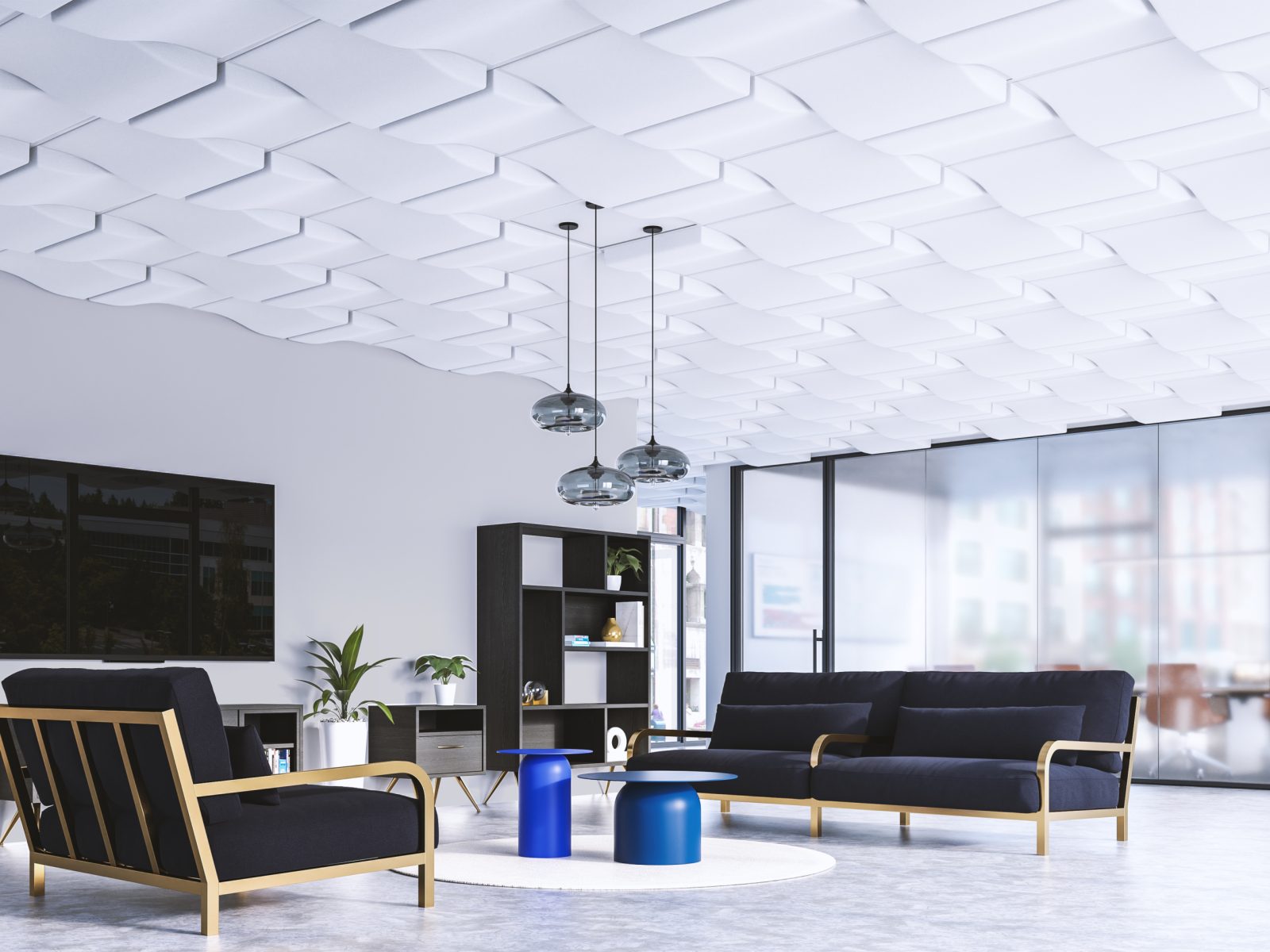
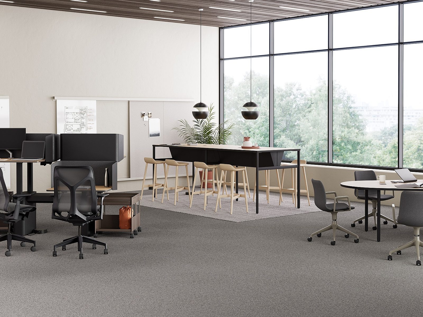
- Neutral Tones: Shades including grey, beige, and white provide equilibrium, refinement, and adaptability.
Careful consideration of each color scheme is paramount. Selecting colors that align with your overarching business objectives and the desired atmosphere is essential for a cohesive and productive space.

Strategic Color Implementation
To maximize color's effect in workplace design, consider these practices:
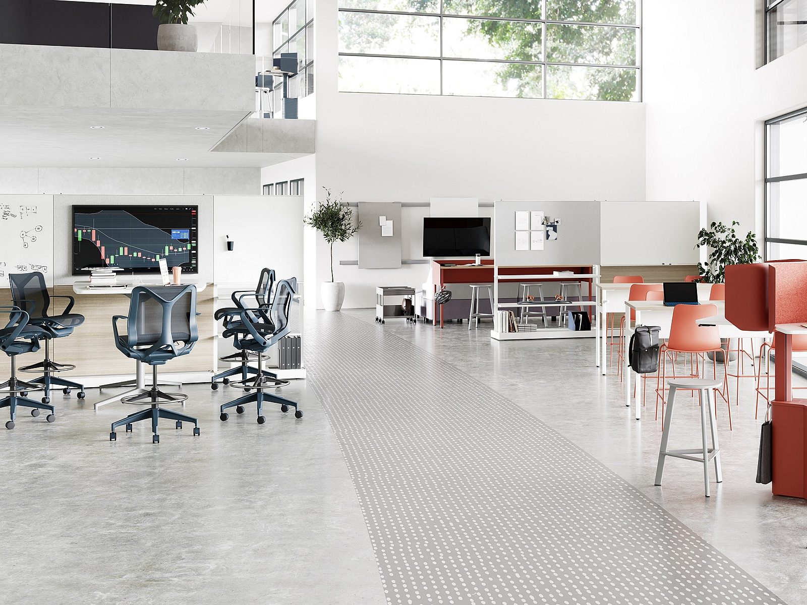
- Zoned Approach: Use color palettes for different functional areas to establish unique ambiances. Lively colors might suit collaborative spaces, while calming shades could benefit quiet work zones.
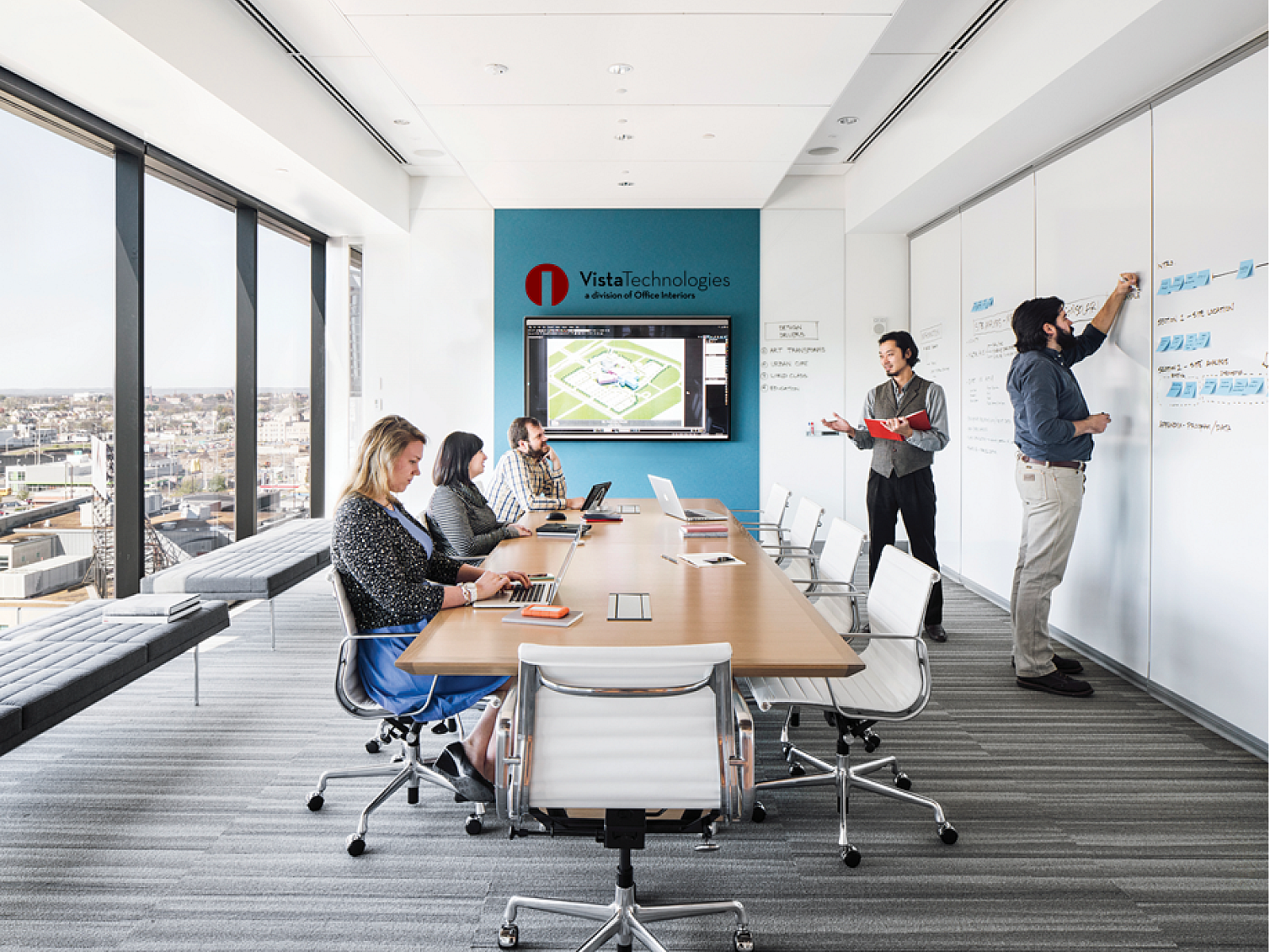
- Brand Alignment: Coordinate color selections with company values and brand identity. The chosen colors can reinforce the organization's visual representation throughout the workspace.
- Natural Light Integration: Emphasize the incorporation of natural light. Its presence alters color perception, contributing positively to the overall work environment.
- Accent Colors: Utilize bold colors as accents rather than dominant wall coverings. This strategy prevents overstimulation and maintains a balanced visual aesthetic within the workplace.
These methods help create workspaces that are both visually appealing and strongly reflective of your brand image.
Use Colors Carefully
- Intense Hues (Overuse):
- Some colors, such as bright yellow, may induce anxiety, irritation, or fatigue if applied too broadly or with excessive intensity.
- Dark blue can generate a feeling of gloom or confinement if not balanced with ample light and complementary colors.
- Misplaced Colors:
- Employing colors that contradict the intended mood for a specific area.
- For example, a vivid red would be inappropriate for a quiet, focused room.
- Cultural Interpretations:
- Recognize that color meanings differ across cultures. Be considerate of all employees and seek feedback on specific color choices. In Western office environments, red is usually limited to being an accent color, since it conveys urgency. In an East Asian office, red is more common, since it invokes prosperity and momentum.
Designing with Purpose
Today, a comprehensive approach to interior design is essential. View it as an investment that yields improved productivity and morale. At Office Interiors, we go beyond mere aesthetics. We apply the science of office color psychology to transform your workspace into a hub of creativity, efficiency, and well-being.
Let us guide you on this vibrant journey of office design, where each shade conveys a message and every hue inspires. Contact us today to discover how thoughtful color choices can elevate your office design.
These tones are particularly effective in areas requiring sustained focus, such as private offices or quiet zones, as they minimize distraction.


